How to fix CSS layout problems?

When you are learning to become a web developer, CSS is something that you are gonna struggle a lot with because there are few things that you will only learn when you yourself face them as issues.
(Especially if you are self-taught).
The one thing people struggle a lot with when learning CSS is layout issues. You are trying to position something and all of sudden margin doesn’t work, height is no longer there (or Disappears) or elements are not positioned right.
People search for the solution to these kinda problems all over the internet, they are searching for solutions like…
How & Why??
“remove vertical space between divs”
“horizontal gap between divs”
“remove horizontal space between divs”
“css collapsing margins”
“how to fix collapsing margins css”
“css contain margins”
“css margin combine”
“css margin inner element”
“margin bottom not working”
“css margin not pushing”
“css margin-left not working”
Some of these problems are related to CSS margin collapsing, you can learn more about it right here (https://mzl.la/1Lye9cf). Other problems are not related to CSS margin collapsing but we are gonna learn to fix them all.
1. text-align: center; (Not Working)
We all use (text-align: center) everyday in CSS for centering text. But as we all know that (text-align: center) can also be used to center elements inside their parent element.
But those who are starting to learn CSS get stuck sometimes and wonder why element is not getting centered. Well, sometimes when you use (text-align: center) text gets centered inside an element but element doesn’t get centered. Why?? because the element you are trying to center is block level element.
By default a block level element takes up 100% width of it’s parent element and that’s why you can’t center it, you need to make it (inline-block) element to center it inside it’s parent element.
(Let me give an example)…
Let’s say you have a container element and inside that container element you have an other element with some text inside.
<div id="container">
  <div id="box">
    <h3>Some Content</h3>
  </div>
</div>
Here are some styles for it.
body{
  background: #ccc;
}
#container{
  background: white;
  width: 500px;
  height: 500px;
  text-align: center;  /* Only content will be centered */
}
#box{
  color: white;
  background: #333;
  width: 250px;
  height: 250px;
}
This is the output…
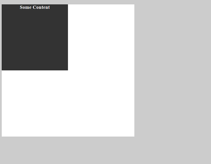
As you can see in the above image that only text is centered and our element isn’t centered. You might be wondering why is that?
Well as I’ve explained above that you cannot center block level element. In order to center an element with (text-align: center), it must be an inline-block level element or inline element.
Now, you need to add a single line to your styles. (To make it happen)
body{
  background: #ccc;
}
#container{
  background: white;
  width: 500px;
  height: 500px;
  text-align: center;
}
#box{
  display: inline-block;  /* Making our element inline-block */
  color: white;
  background: #333;
  width: 250px;
  height: 250px;
 }
This is the output now…
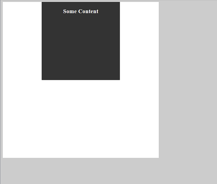
Magic huh? Well, It isn’t a magic because you know how it works now. ;)
2. Space between inline-block level elements
This is a problem that almost every one of us get into when we are starting to learn CSS and we don’t know how to fix it. Some of us start to scratch our heads while others run towards Stackoverflow.
The most annoying situation is when you have a parent div and inside that div you have two other divs. What you want to do is make those two divs take up the 50/50 of available space of their parent element.
But because of this extra space in inline-block element you end up scratching your heads and some of us try to do something like 49.88% or 49.76% with our divs while in a state of anger.
(Let me give an example)…
Lets say we have two elements with equal width & height and we want them to take the 50/50 of available space inside their parent element.
<div id="container">
  <div id="first"></div>
  <div id="second"></div>
</div>
Here are some styles for it.
body{
  background: #ccc;
}
#container{
  background: white;
  width: 500px;
}
#first,#second{
  display: inline-block;
  color: white;
  background: #333;
  width: 50%;
  height: 250px;
}
This is the output…
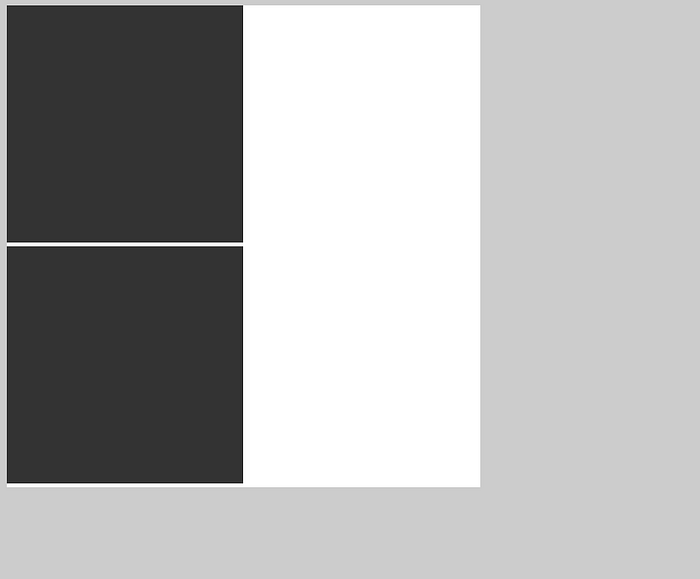
As you can see they are not taking 50/50 space of their parent because there is a space between them and that’s causing this issue.
There are 2 common ways to fix this problem.
2.1 — Using comment
2.2 — Removing space between elements inside HTML file
2.1 — Using comment.
All you have to do is add a comment between two inline-block elements because the space between them is showing up as a space in our output.
<div id="container">
   <div id="first"></div><!--
--><div id="second"></div>
</div>
2.2 — Removing space between elements inside HTML file
What you have to do is remove space between two inline-block elements inside your HTML file because the space between them ends up showing in the results or output.
<div id="container">
   <div id="first"></div><div id="second"></div>
</div>
Here is the output…

3. Inline-block element layout break
This is a kind of a problem that some of you have already seen who are some what experienced while others may haven’t seen it yet.
This problem usually occurs when you have two inline-block level elements in front of each other and you try to add some content in on of them and suddenly the layout breaks.
Here is some HTML for this example.
<div id="first">
  <h3>Some content</h3>
</div>
<div id="second"></div>
Here are some styles.
body{
  background: #ccc;
}
#first,#second{
  display: inline-block;
  color: white;
  background: #333;
  width: 250px;
  height: 250px;
}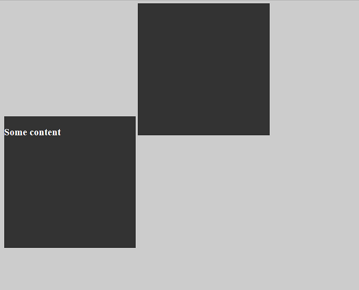
As you can see that our layout is breaking because the top of 1st element is aligned with the bottom of 2nd element and we know this is an alignment issue. Alright, what is the solution to this problem?? (Pretty simple)
There are two ways to fix this problem.
3.1 — add ( overflow: hidden; )
3.2 — add ( vertical-align: middle; )
// one can use vertical align top, bottom as well
// (if you know how these work)
3.1 — overflow: hidden;
In this solution all you have to do is add ( overflow: hidden; ) to all of your inline-block elements or to the ones who are causing the problem.
body{
  background: #ccc;
}
#first,#second{
  display: inline-block;
  color: white;
  background: #333;
  width: 250px;
  height: 250px;
  overflow: hidden;    /* overflow: hidden; will fix the problem*/
}
3.2 — vertical-align: middle;
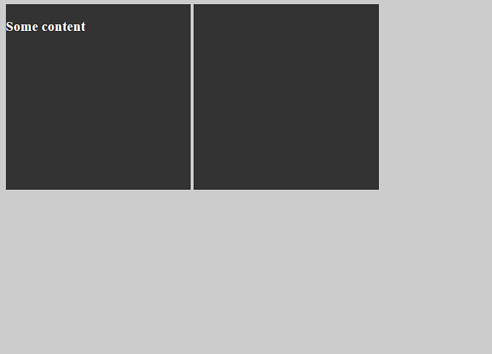
In this example all you have to do is replace the ( overflow: hidden; ) with (vertical-align: middle;) and the problem will be solved but as I’ve mentioned above you must know the working of these vertical-align top,middle,bottom.
Let me explain a bit…
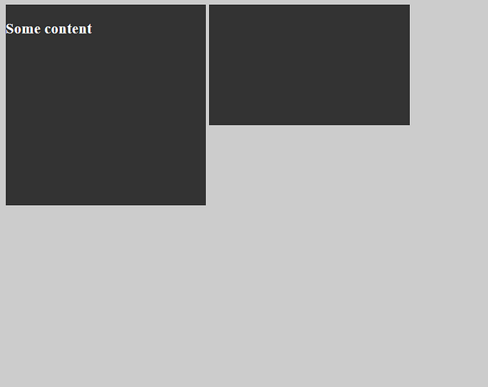
Lets say you have two elements of different height and you add (vertical-align: top) to them, then the result will be like this. As you can see their top is aligned with each other. Same thing goes with middle and bottom. (you can experiment yourself)
Again, as I’ve mentioned above that (overflow: hidden;) is the best solution. So, if you don’t know what you are doing then stick to ( overflow: hidden; ).
Alright now replace the overflow: hidden with ( vertical-align; middle ).
body{
  background: #ccc;
}
#first,#second{
  display: inline-block;
  color: white;
  background: #333;
  width: 250px;
  height: 250px;
  vertical-align: middle;   /* using vertical-align: middle; */
}
4. Floating elements have no height?
This is one of the most annoying problem that one who is starting to learn CSS can face in his day to day projects.
I remember when I encountered this problem for the first time I was like what the heck is going on? I can float my elements and that’s exactly what I want but what’s wrong with my layout? Is there no height or what?
Then what I did was I added float elements into another element and gave that element a height to fix the issue or sometimes I would use padding and other methods as a hack to fix my problem.
But now, I know appropriate solution to this problem (After years of practice) and that’s exactly what I’m going to show you guys today but First look into the problem before we start fixing it.
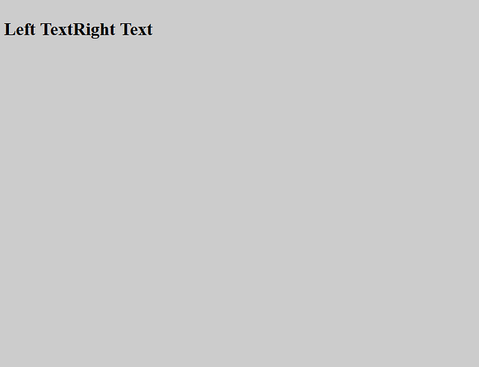
Lets say you have 2 headings and you float one to the left and all of sudden the 2nd heading stick itself to the top and appears as it comes before the 1st heading in the HTML markup. (Weird layout issue)
Alright, Here is some HTML to explain first problem.
<h2 id="left">Left Text</h2>
<h2 id="right">Right Text</h2>
Here are some styles.
body{
  background: #ccc;
}
#left{
 float: left;
}
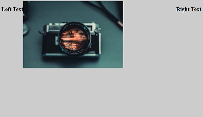
There is one more scenario, lets say you float both of the headings, one to the left and other to the right then the element after them will come up and that’s maybe because floating elements have no order. (Example is below)
Here is some HTML markup for example.
<h2 id="left">Left Text</h2>
<h2 id="right">Right Text</h2>
<img src="https://bit.ly/2LsgNeT">
Here are some styles.
body{
  background: #ccc;
}
#left{
 float: left;
}
#right{
  float: right;
}
img{
  width: 50%;
}
Here is the output…
Alright, now its time to fix this problem.
There are 3 possible solution to this problem.
4.1 — overflow: hidden;
4.2 — display: inline-block;
4.3 — position: absolute; (not every effective though)
4.1 — Overflow Hidden;
First you have to do is wrap the floating elements into a parent element, something like div and then add overflow of hidden to that element.
<div id="wrapper">
  <h2 id="left">Left Text</h2>
  <h2 id="right">Right Text</h2>
</div>
Here are some styles.
body{
  background: #ccc;
}
#wrapper{
  overflow: hidden;
}
#left{
 float: left;
}
4.2 — display: inline-block;
This solution is same as above, all you have to do is add display of inline-block to the parent element and everything will be fixed.
But remember using inline-block doesn’t make element after the first element come next to the first element because that element isn’t floating and it is still a block level element so it wants to take up the full width.
There is a solution that is some what confusing and you need some calculation for it to work. What you need to do is measure the width of floating element + the width of parent element then add both values and give the parent element the new width with the value you got.
floating element width + parent element width = new parent width
What is happening is that first heading is being floated to left, parent is inline-block so doesn’t take up full width that’s why 2nd element can’t come to next to the 1st element because 2nd element wants to take up the full width of the parent element.
So, if you do the above calculation then it’s able to take up the full width of its parent element and that end up fixing the problem.
confusing right?? 😓
Exactly it is confusing + non-scalable and that’s why I’m gonna stick with easiest possible solution in this example.
You can either give the second element a display of inline-block or what you can do is also float the second element. ( both solutions work best)
— I’m using float in the below example.
Note:
Don’t forget to use vertical-align if you parent element has small width.
Because when we use inline-block, element doesn’t have 100% width.
Below I’m showing both example with and without vertical-align.
<div id="wrapper">
  <h2 id="left">Left Text</h2>
  <h2 id="right">Right Text</h2>
</div><img src="https://bit.ly/2LsgNeT">
Here are some styles with vertical-align.
body{
  background: #ccc;
}
#wrapper{
  background: white;
  display: inline-block;
  vertical-align: top;        /* using vertical align */
}
#left{
 float: left;
}
#right{
  float: right;
}
img{
  width: 50%;
}
Also, below is the solution without using vertical-align.

You can see the first element is bottom aligned with second element, We have already talked about this issue in above examples and you know that you can solve it by using vertical-align.
4.3 — position: absolute;
Lastly we have position absolute, by using position absolute we get height of our parent back + the background of our parent but then we get into another problems and that problem is that we have our parent element absolutely positioned now which can leads to many other layout issues.
I think this can only be helpful if you are using an absolutely positioned element and nothing comes after it & everything is inside that element.
You can also add an other element as a space after every absolutely positioned element. (Kinda like a hack hmm…)
I know this isn’t the best solution and that’s why I’ve already marked it as the least effective solution above.
Ok, let me show you how it works.
<div id="container">
  <div id="wrapper">
    <h2 id="left">Left Text</h2>
    <h2 id="right">Right Text</h2>
  </div>
</div><img src="https://bit.ly/2LsgNeT">
Here are some styles.
body{
  background: #ccc;
}
#wrapper{
  background: white;
  position: absolute;
}
#left{
 float: left;
}
#right{
 float: right;
}
img{
  width: 50%;
}
5. Margin top isn’t working??
This is also one of the most common problem people run into almost all the time and some of us learn to use padding instead of real solutions.
This problem is known as margin collapsing (read more here)
Sometimes we have an element inside another element & when we try to give margin to the element which is inside we notice that parent element is getting margin from the top instead of child element getting margin from the inside. (that’s a issue isn’t it?)
Some HTML to explain the problem.
<div id="container">
  <div id="box"></div>
</div>
Here are some styles.
body{
  background: #ccc;
}
#container{
  background: white;
  width: 500px;
  height: 500px;
}
#box{
  background: #333;
  width: 250px;
  height: 250px;
  margin-top: 100px;    /* giving margin from the top */
}
As you can see is that we are trying to give box a margin from the top but instead our container is getting margin from the top. (Confusing huh?)
Indeed, it is confusing to someone who is starting out or have less experience with this kinda issues. (but don’t worry, you are about to learn the solution)
So, what’s the solution to this problem??
Well, there are 6 solutions to this problem (not all are best solutions though).
5.1 — Giving child element a display of inline-block.
5.2 — Giving parent element a display of inline-block.
5.3 — Giving parent element an overflow of hidden.
5.4 — Giving parent element a position of absolute.
5.5 — Giving parent element transparent border.
5.6 — Giving parent element padding from the top or from (top & bottom).
5.1 — Giving Child element a display of Inline-block
In this solution what you have to do is give your child element a display of inline-block and it solves your problem of margin.
Some HTML markup for solution.
<div id="container">
  <div id="box"></div>
</div>
Here are some styles.
body{
  background: #ccc;
}
#container{
  background: white;
  width: 500px;
  height: 500px;
}
#box{
  display: inline-block;     /* using inline-block for solution */
  background: #333;
  width: 250px;
  height: 250px;
  margin-top: 100px;
}
5.2 — Giving parent element a display of inline-block
This solution is similar to the first one, all you have to do is instead of giving your child element a display of inline-block, you have give your parent element a display of inline-block.
body{
  background: #ccc;
}
#container{
  display: inline-block;   /* display inline block to parent elem */
  background: white;
  width: 500px;
  height: 500px;
}
#box{
  background: #333;
  width: 250px;
  height: 250px;
  margin-top: 100px;
}
Here is the output…

5.3 — Giving parent element an overflow of hidden
In this example all you have to do is give your parent element an overflow of hidden and your margin top will start to work fine.
body{
 background: #ccc;
}
#container{
 background: white;
 width: 500px;
 height: 500px;
 overflow: hidden;   /* using overflow hidden */
}
#box{
 background: #333;
 width: 250px;
 height: 250px;
 margin-top: 100px;
}
Here is the output…

5.4 — Giving parent element a position of absolute
In this example all you have to do is give your parent element a position of absolute, although it makes your parent element absolutely positioned element but it also fixes the margin issue. (may not be that useful though)
body{
 background: #ccc;
}
#container{
 background: white;
 width: 500px;
 height: 500px;
 position: absolute;     /* using position absolute */
}
#box{
 background: #333;
 width: 250px;
 height: 250px;
 margin-top: 100px;
}
Here is the output…

5.5 — Giving parent element transparent border
In this example you need to give your parent a transparent border of any size. Making it transparent has no special effect though and you can give any color if you want it to have a color of some sort.
body{
 background: #ccc;
}
#container{
 background: white;
 width: 500px;
 height: 500px;
 border-top: 0.1px solid transparent;    /* using border */
}
#box{
 background: #333;
 width: 250px;
 height: 250px;
 margin-top: 100px;
}
Here is the output…

5.6 — Giving parent element a padding from top or (top & bottom)
This solution is also the easiest one and all you need to do is give your parent element a padding of any size from the top or bottom, you can also give padding from both top and bottom.
body{
 background: #ccc;
}
#container{
 background: white;
 width: 500px;
 height: 500px;
 padding: 0.1px 0;      /* giving padding from top & bottom */
}
#box{
 background: #333;
 width: 250px;
 height: 250px;
 margin-top: 100px;
}
Here is the output…

Alright folks that’s about it. — (You made it) 🎉
I hope you guys enjoyed this article because I did my best to share with you guys some of the issues beginner developers face when they are trying to learn CSS (Now you know the solution to those problems).
Lastly, as we all know that no one is perfect & nothing is perfect so if you find any errors in this article then feel free to comment below asap (So, I can fix them for other readers). #ThankYou 👍
Ohhh and one more thing!! Don’t forget to like and share with others. 🙂
If you have any questions regarding any of my articles or something else then feel free to reach out to me at my twitter handle @amjustsam.

![How to find most frequent item of an array? [Updated]](https://miro.medium.com/v2/resize:fit:679/1*JzDmzuRPNPBdlsaBdtn9kQ@2x.png)


